Welcome to Olivia Carder's Portfolio

Scroll or click the menu to explore commission options and conceptual work

_1_edited.jpg)

.jpg)


Cemetery Drive
Chalk Pastel on paper
March 2025
Conceptual Works
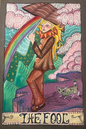
The Fool
Chalk Pastel on paper
18"x 24"
May 2025


Man vs Machine
Collage
10.5"x 8.5"
June 2024
Possibly Maybe Someday
Oil paint, glitter and ribbon
36"x 48"
April 2026
About Olivia Carder
My name is Olivia Carder, I am a 23 year old art student graduating from Miracosta College and about to transfer to UCSD this fall. I am a second-generation Brazilian, and I am proud to be pansexual and gender-curious. My work focuses on my own love for the whimsical and fantasmic, as well as a return to childhood innocence and wonder. As a child, I was always enchanted by the beautiful illustrations in children’s books, and would constantly find myself rereading certain ones just to immerse myself in a world where so many unfathomable things were possible and to admire the beautiful worlds that were created both visually and in writing. I’m a huge fan of bright, beautiful colors and bold lines, and I invoke these themes in a number of mediums such as chalk pastel, crayon, watercolor, acrylic, collage, mixed media and more. With references to memory and pop culture combined with fantasy and playfulness, my work reminds me and hopefully others to step away from everyday stresses and allow myself to return to what makes me feel truly myself.

Artistic Interests
My main medium consists of 2D art, such as drawing, painting, and mixed media art. I am specifically interested in portraiture, fantasy, and nostalagia
A hobby an art form of mine is also cooking and baking. While I am not formally trained in either of these skills, it is something that I enjoy exploring creating for family and friends.
I am always looking to explore new mediums and work with new people. I have a strong interest in community work as well.
Contact Information
Send me a message for inquiries on commissions, collaborations, or to simply share your thoughts on the art presented in the portfolio.
email: livia.carder@gmail.com
instagram: @slugcollector
